Viridian Design System
Scaling one job-card component across search, save, and apply surfaces
I worked on the Viridian Design System at ZipRecruiter, where a single job listing had grown a different version of its card on every surface it appeared: anonymous SEO pages, logged-in grids with save and apply actions, and dense mobile layouts. I consolidated those into two flexible components, Card and Options List, and documented when to use each variant. I validated them through adoption, sitting with the teams integrating them across SEO, logged-in, and mobile flows.
Role
Senior Product Designer, design systems and marketplace UX
Owned
Card and Options List components, adoption docs across SEO, logged-in, and mobile surfaces
Team
Design systems pod embedded in a fast-moving marketplace product org
Platform
Consumer job marketplace, Viridian Design System (VDS)
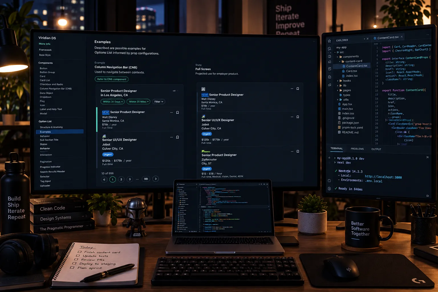
Strategic context & problem
A job listing on ZipRecruiter shows up in a lot of different places: an anonymous SEO landing page, a logged-in dashboard grid with save and apply actions, a dense mobile layout. By the time I joined the design systems team, each of those surfaces had grown its own version of the same job card. That wasn’t just visual drift, it meant a “Save” button that behaved slightly differently depending on where you clicked it, salary formatting that didn’t match from one team’s screens to another’s, and design and engineering effort spent rebuilding the same component every time a product team touched a listing.
Process
I worked inside a small design systems pod, pairing wireframes and usage analytics from each surface with direct observation of job seekers scanning listings under time pressure, since a job card that reads well in isolation can still fail when someone’s rapid-scanning a results page. I documented where the existing patterns actually diverged, not just where they looked different, and used that as the brief for consolidating them into a single flexible component instead of a redesign that a fourth team would eventually fork again.
Solution
🧩 Component: Card
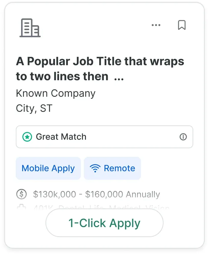
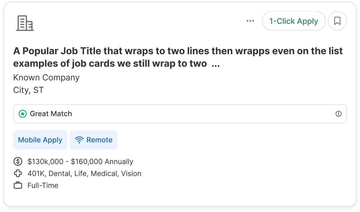
The Card component was designed to present job postings clearly and engagingly, so applicants could quickly identify opportunities. Built for scalability, it supported SEO pages, logged-in grids with actions like saving or applying, and mobile layouts optimized for limited screen space. Consolidating those use cases into one flexible component kept the experience consistent while streamlining both design and development.
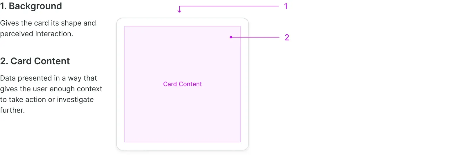
1. Background
Gives the card its shape and perceived interaction.
2. Card Content
Data presented in a way that gives the user enough context to take action or investigate further.
👉 Examples
Job Card Grid (default)
Job Card List (SERPs)
🧩 Component: Options List
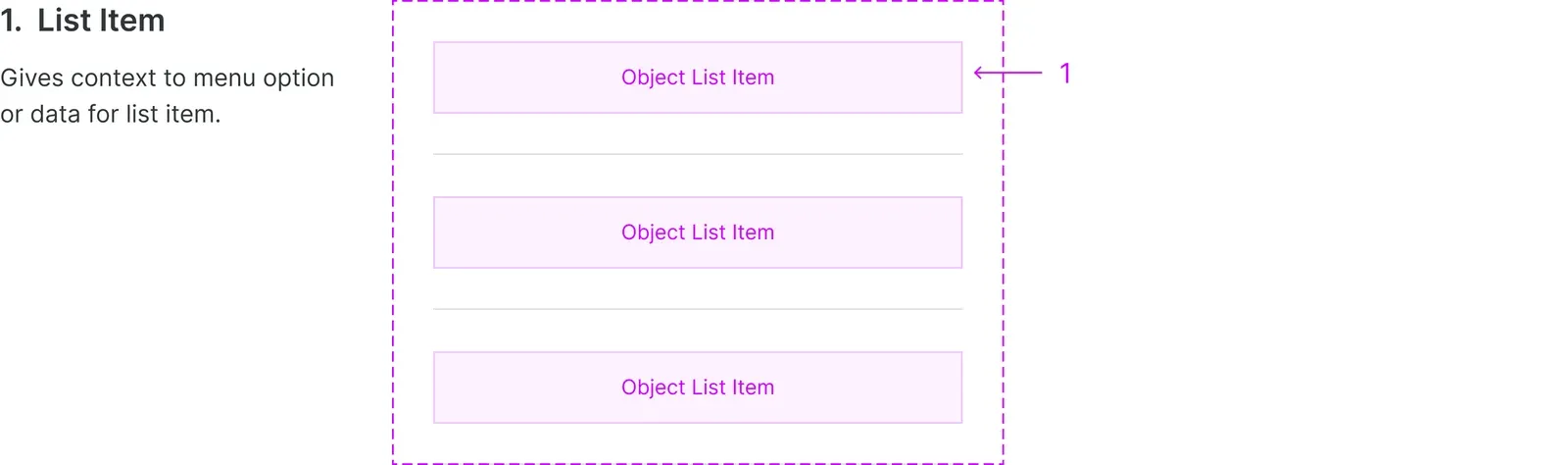
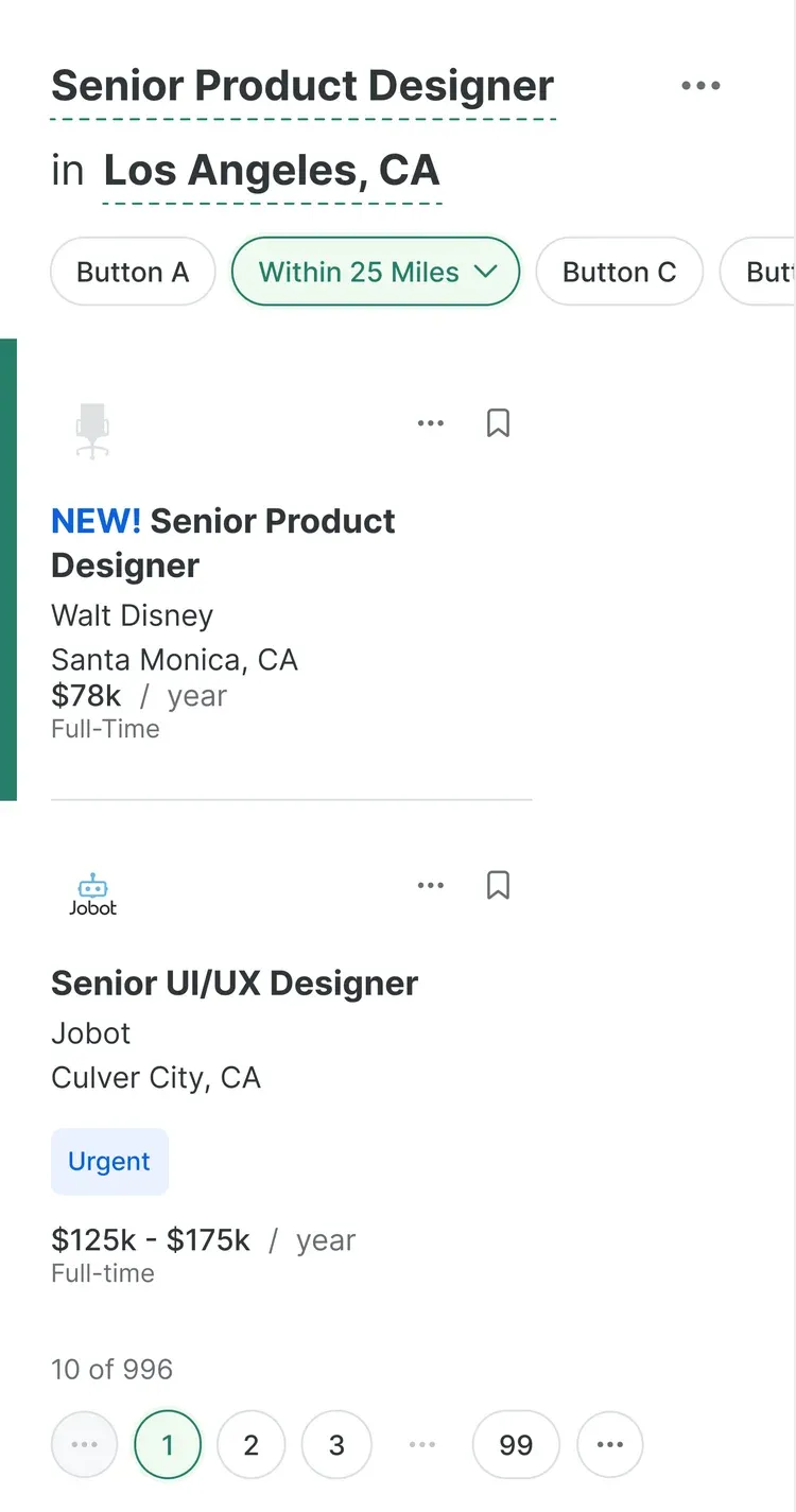
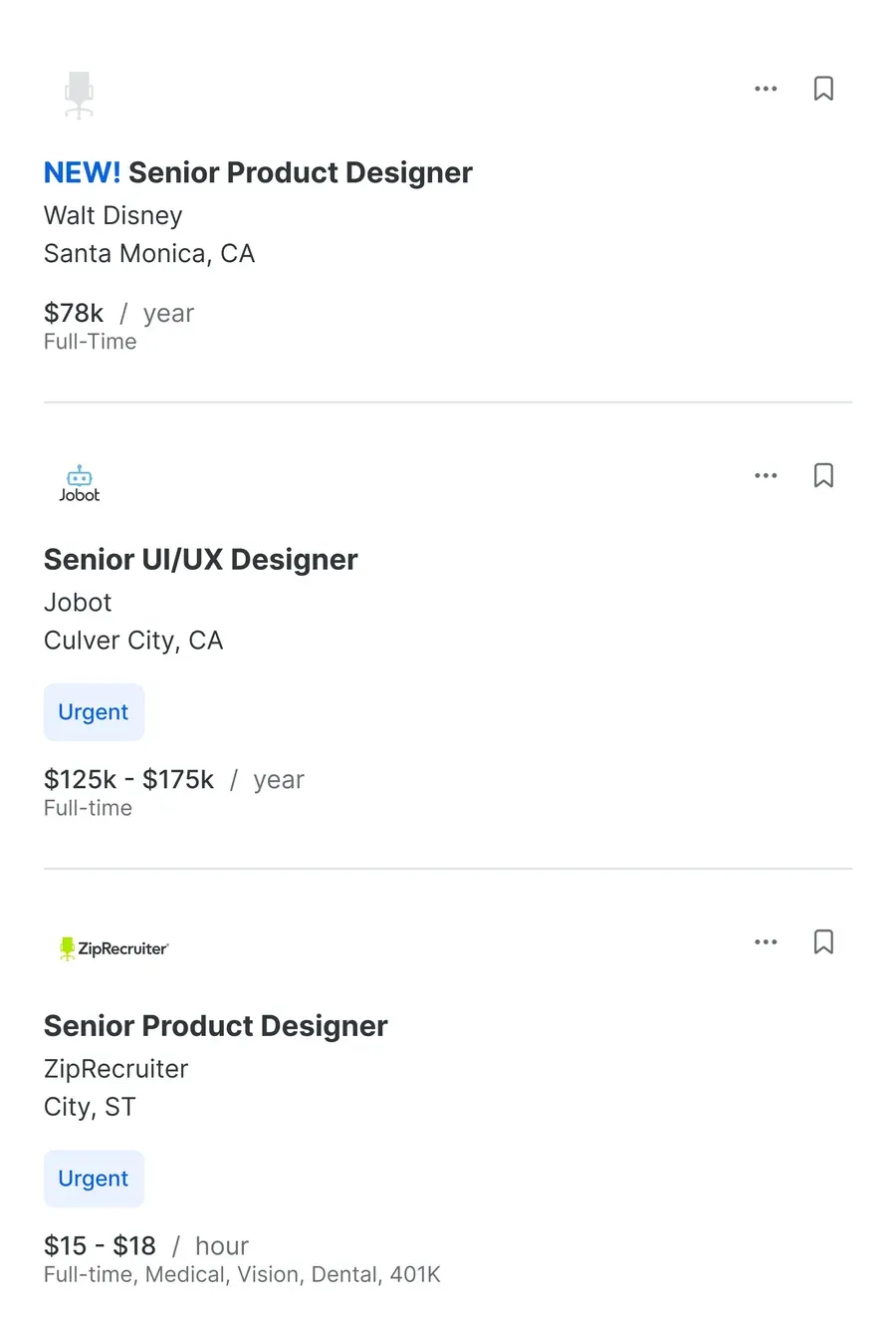
I created the Options List component to display items across various contexts, such as navigation bars or job posting lists. Designed for adaptability, it ensured consistency and usability everywhere a set of items needed to appear, from navigation for job seekers exploring opportunities to search results presented as organized, dynamic lists.
1. List Item
Gives context to menu option or data for list item.
👉 Examples
Column Navigation Bar (CNB)
Full Screen
Validation
There was no dedicated usability lab for this work, validation happened through adoption. I wrote documentation covering when to use each variant and why, sat with teams integrating the components into SEO pages, logged-in grids, and mobile flows, and adjusted the component API when a real use case didn’t fit cleanly. A pattern only counts as validated once a team outside the one that built it picks it up without needing a workaround.
Takeaway
The hard part of this work was never drawing a nicer job card, it was resisting the urge to let “this surface is a little different” justify a new component every time. Consolidating Card and Options List into patterns flexible enough for SEO, logged-in, and mobile contexts meant slower initial design work and much faster delivery for every team after the first one. That trade held up, and it’s the same trade I’d make again on any design system carrying this much surface-area variety.
Other projects
Let's build something
worth trusting.
Get in touch
Have a role, a team, or a hard problem worth solving? Send a note and I'll get back to you.