Universal Navigation
One navigation system for a fragmented HR product suite
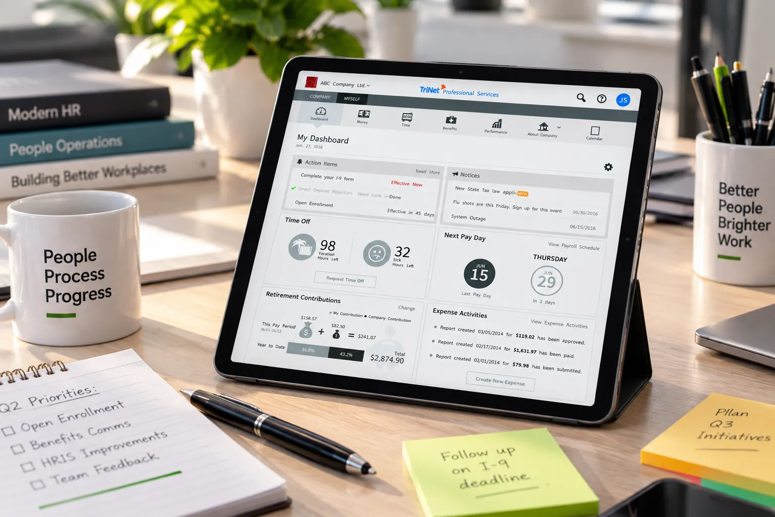
I was one of several designers on TriNet's universal navigation initiative, replacing the separate navigation conventions of an HR suite that had grown module by module with one persistent system that looks and behaves the same across Money, Time, Benefits, and Performance. I owned roughly a third of the design work, from IA workshops through usability testing, and the same structure folded into a slide-out drawer on mobile. It shipped as the shared scaffolding every subsequent TriNet product redesign built on.
Role
Interaction Designer II, one of several designers on a cross-product navigation initiative
Owned
Roughly a third of the project's design responsibilities: IA workshops through usability testing
Team
Multi-designer effort spanning TriNet's full product suite
Platform
Cloud-based HR platform: Money, Time, Benefits, Performance, and more
Strategic context & problem
TriNet’s HR platform had grown module by module, Money, Time, Benefits, Performance, each shipped with its own navigation conventions because each had been built by a different team at a different time. An employee moving from checking a paycheck to requesting time off had to relearn where things lived every time they crossed a module boundary. TriNet needed one navigation system that worked identically everywhere, not another module-specific pattern that would just add a fifth convention to the pile.
Process
I was one of several designers on this initiative, contributing roughly a third of the overall design work across information architecture, wireframing, and testing. We ran multiple rounds of usability testing rather than converging on a single internal opinion about what “intuitive” meant, since a navigation system that only makes sense to the people who designed it fails the moment a real employee opens it. Each round surfaced specific friction points, ambiguous icon labels, an inconsistent Company/Myself toggle, that we iterated against directly rather than re-testing the whole system from scratch every time.
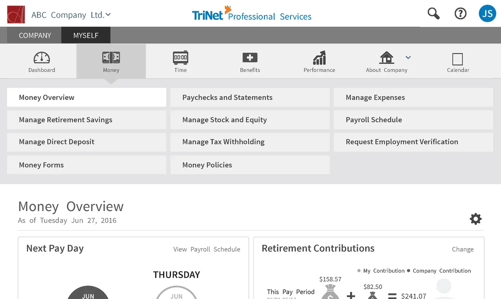
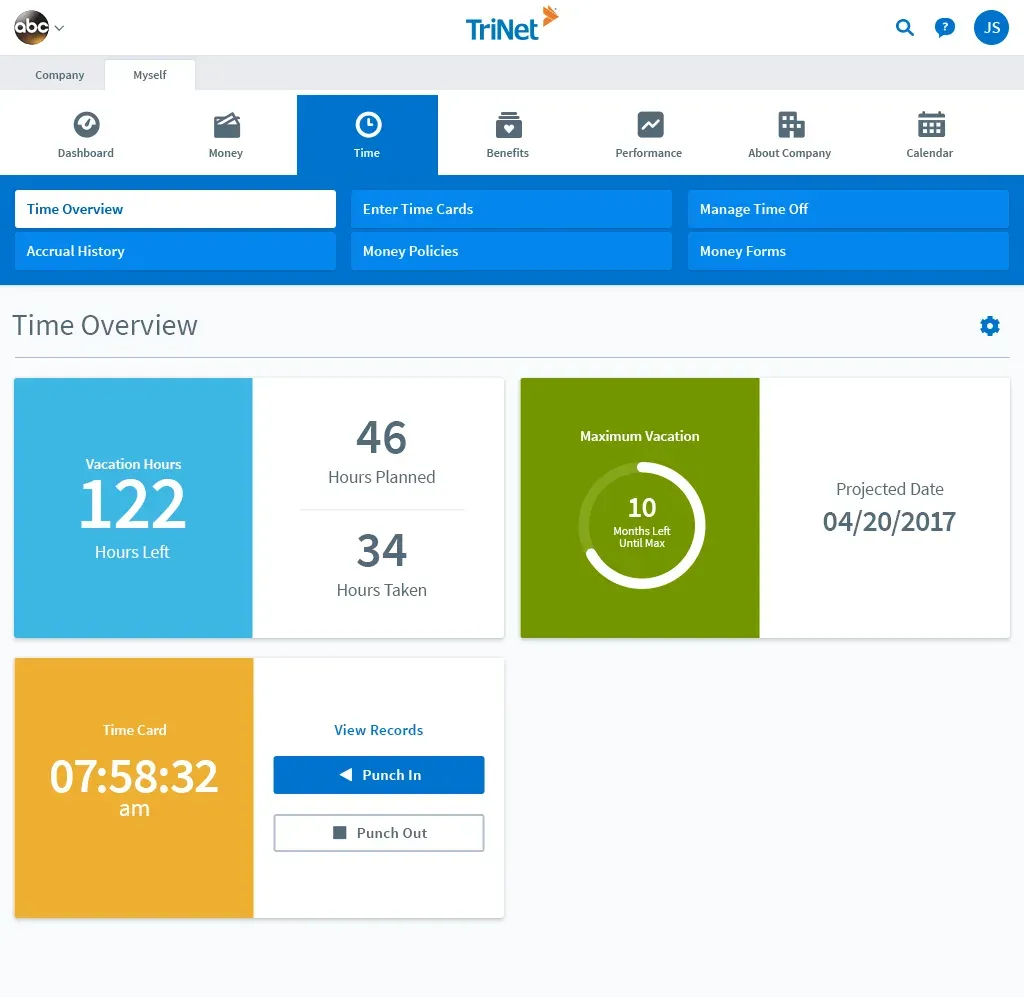
The Time module reused that exact same frame. Nothing about the navigation, the tab layout, or the page chrome changed, only the content underneath it did, which was the point: an employee shouldn’t have to relearn the shell just because the task changed.
Solution
The shipped system was deliberately unglamorous: one persistent top navigation bar, Dashboard, Money, Time, Benefits, Performance, About Company, Calendar, that looked and behaved identically whether an employee was inside the Money module or the Time module. A Company/Myself toggle sat above it, giving the same navigation frame two clearly separated contexts instead of duplicating the whole nav for each.
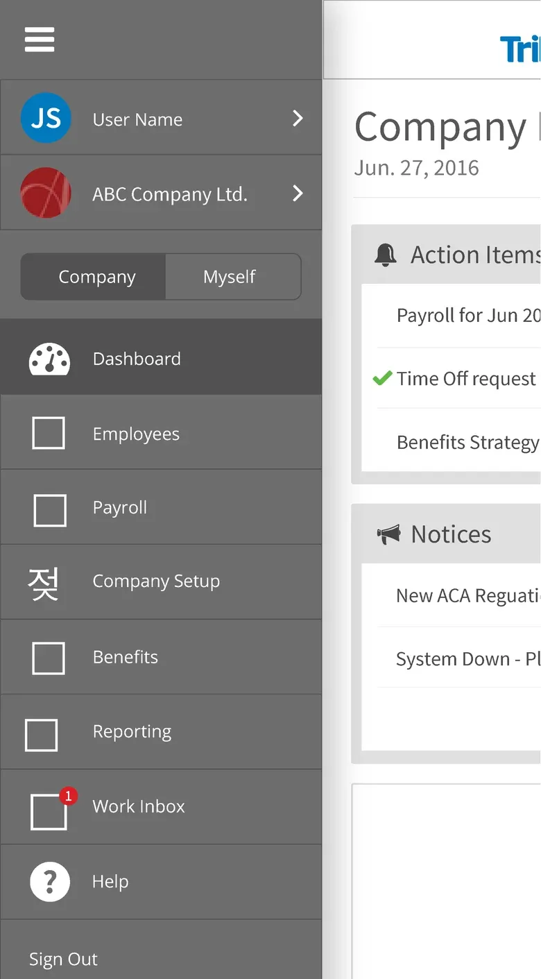
On mobile, that same structure had to fold into a much smaller footprint. Rather than hiding navigation behind an unfamiliar pattern, we used a slide-out drawer that preserved the exact same item order and labels as the desktop bar, so the mental model an employee built on one device transferred directly to the other.
Dashboard, collapsed to a single column
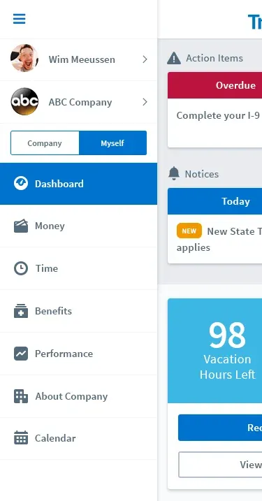
The slide-out drawer, same order and labels as desktop
Validation
Usability testing was iterative, not a single gate at the end. We tested early wireframes for comprehension, tested again once visual design was applied to catch anything the polish had changed, and tested the mobile drawer separately since a pattern that reads clearly at desktop width doesn’t automatically survive being compressed into a hamburger menu.
Outcomes & impact
This shipped as foundational infrastructure rather than a feature with its own launch metrics: the navigation system became the shared scaffolding every subsequent TriNet product redesign built on top of, which was the actual goal. Success here looked like every module after this one inheriting a working pattern instead of inventing its own.
Takeaway
Unifying navigation across a product suite is a project that only looks small from the outside. The real work was reconciling four teams’ worth of existing assumptions about what navigation should do, and getting enough people to agree on one answer that it could actually ship everywhere at once. I’d still rather own a third of something every team relies on than all of something only one team uses.
Other projects
Let's build something
worth trusting.
Get in touch
Have a role, a team, or a hard problem worth solving? Send a note and I'll get back to you.