ELD Driver App
A compliant electronic logging app that took truckers from paper to digital
I led UX for Cartrack's ELD driver app, a 0-to-1 electronic logging device product that replaced paper driving logs with real-time digital records under a federal mandate. The core challenge was trust: skeptical drivers, strict legal logging requirements, and total consistency between the mobile app and the dispatcher dashboard. I owned the mobile app end to end and mentored a junior designer into full ownership of the dispatcher web experience. Within a year the App Store rating rose from 3.7 to 4.2, and 80% of users rated the app easy to use.
A compliant electronic logging app that took truckers from paper to digital
Role
Lead UX Designer, business direction, co-owned product decisions with the CEO
Owned
Mobile app UX end-to-end, research direction, design vision
Delegated
Dispatcher web experience, mentored a junior designer into full ownership of it
Team
Lead designer, 1 junior designer, 3 engineers, CEO acting as PM
Platform
Native mobile ELD app (iOS/Android) plus a web dispatcher dashboard
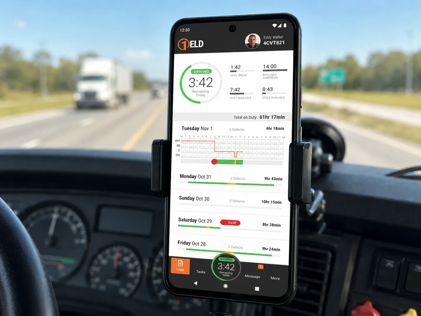
Strategic context & problem
This was a 0-to-1 build: an Electronic Logging Device app for truck drivers, required by federal mandate to replace paper driving logs with real-time digital records. It wasn’t just a compliance checkbox, it was what kept a trucking business legally operational as regulations shifted. From day one I treated compliance as a design constraint rather than a blocker, which shaped the whole UX strategy that followed.
The core challenge wasn’t technical, it was trust. Truckers who’d used paper logs for years saw digital tools as less flexible and harder to trust, not more convenient. Layered on top of that: strict legal requirements dictating exactly how the app had to log, connect via Bluetooth, and record data, and the need for total consistency between the mobile app drivers used and the web dashboard dispatchers relied on.
Process
I led research with the junior designer I was mentoring on the project: interviews with truckers and dispatchers, audits of competitor apps for compliance-focused UX patterns, and early conversations with compliance experts to validate direction before we designed anything. I also pulled the CEO, acting as our PM, and engineers into synthesis sessions, which built shared understanding across the team from the start instead of design finding out what engineering couldn’t do after the fact.
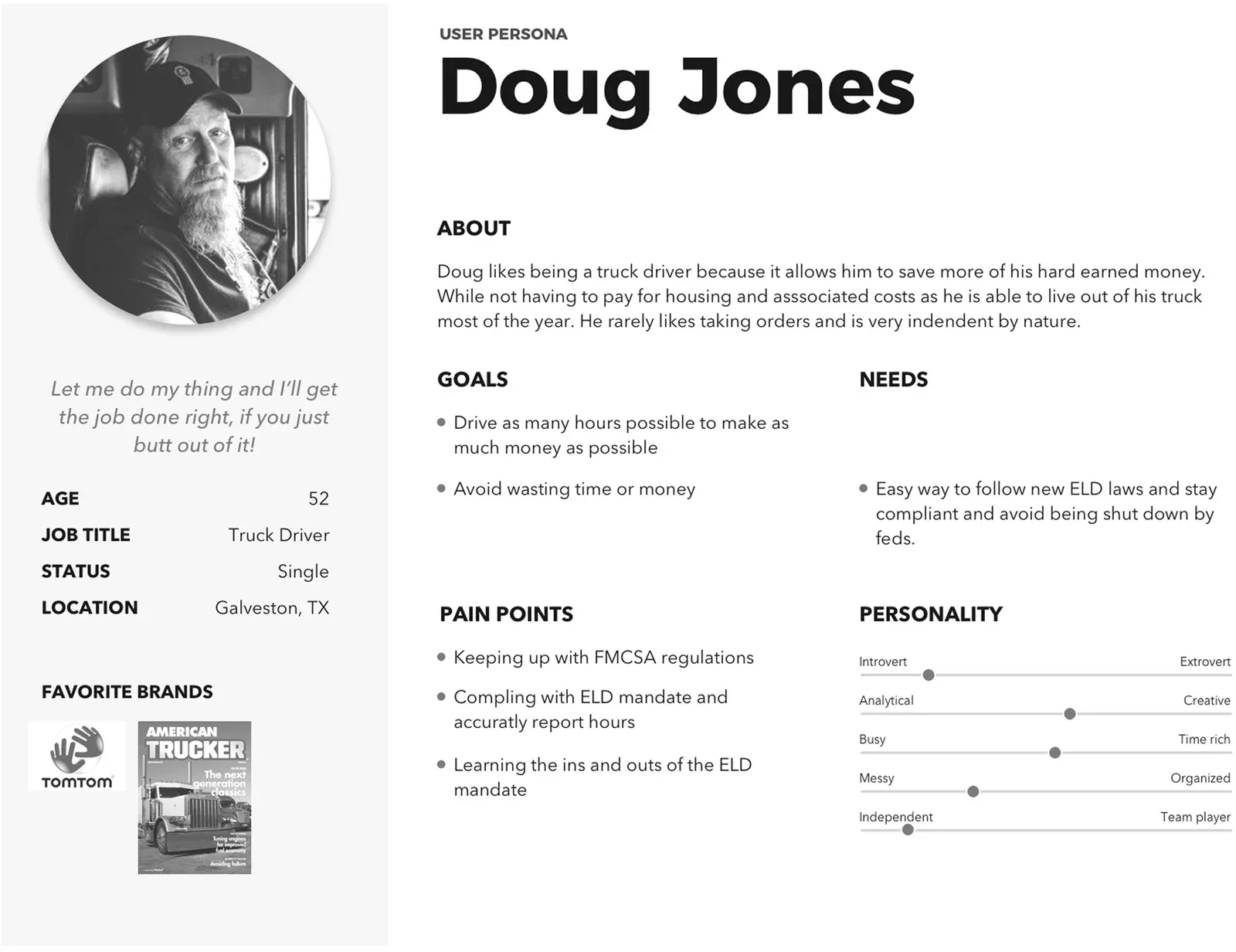
Mentoring was part of the actual work here, not separate from it. I started the junior designer on research, then expanded her scope until she owned the dispatcher web flows end to end, using structured critiques and clear milestones to build both her judgment and her autonomy.
Solution
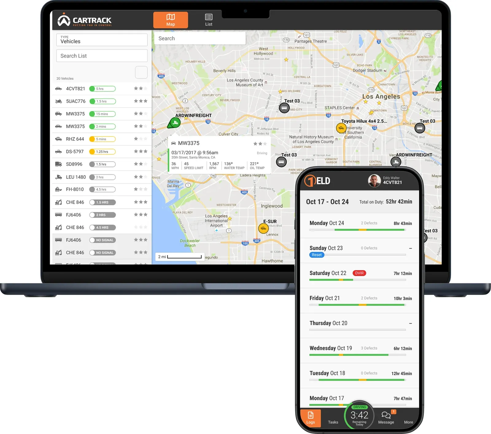
With the constraints and user resistance mapped, I led design on the core UX patterns: logging flows, connectivity states, and compliance alerts, while directing the junior designer’s work on the dispatcher dashboard she’d go on to own. We worked in close, frequent contact with mobile, web, and hardware engineers, since a Bluetooth connectivity failure or a sync delay wasn’t just a UI edge case, it was a compliance risk.
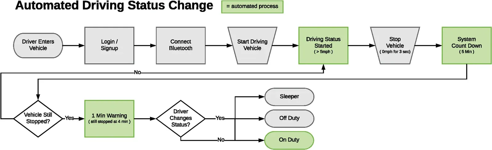
One of the trickiest flows was automated status detection: FMCSA rules meant the app had to infer a driver’s duty status from vehicle movement, not wait for a manual toggle, while still giving the driver a clear window to confirm or override it before the system changed it for them.
Early warning (4:59 remaining)
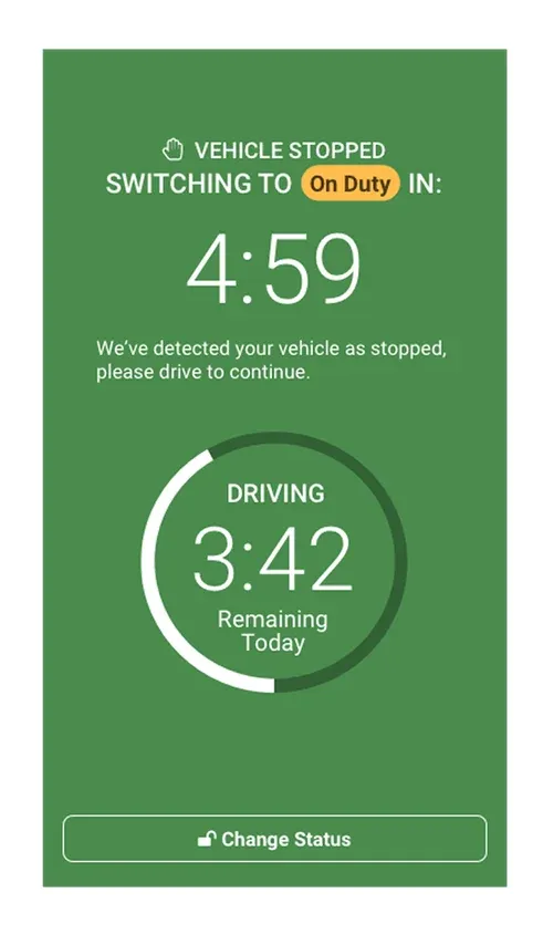
Final warning (0:59 remaining)
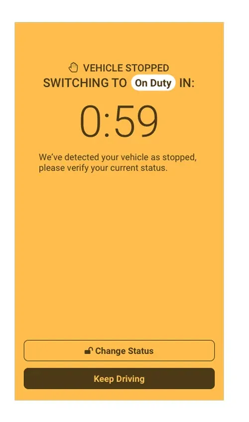
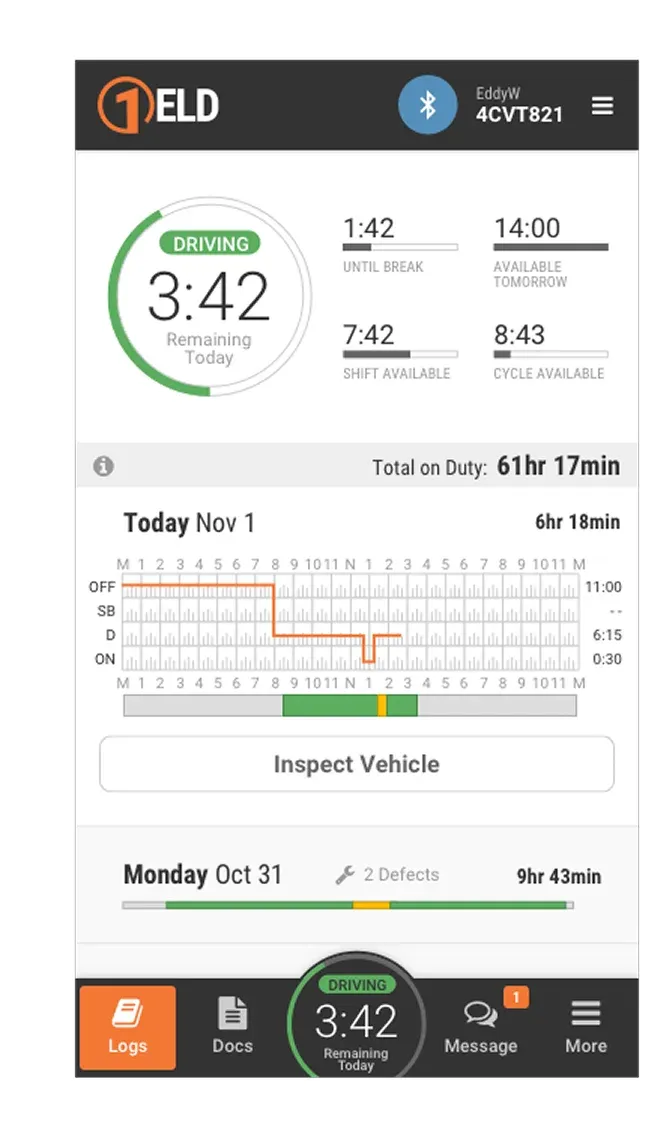
I introduced async video walkthroughs and lightweight QA checklists to keep handoff fast without losing design fidelity as the team scaled across mobile, web, and backend.

Validation
I ran structured testing with truckers and dispatchers evaluating usability and compliance together, not as separate passes, then used those sessions to redesign the dispatcher dashboard for consistency with the mobile experience. Post-launch, I set up a quarterly feedback loop so we kept measuring satisfaction, completion rates, and support ticket volume instead of treating launch as the finish line.
Outcomes & impact
20%
monthly increase in app adoption within 3 months
4.2★
App Store rating, up from 3.7 in one year
80%
of users rated the app easy to use
18%
decrease in support tickets tied to logging errors
We also built out reusable components along the way, which cut prototyping time on every flow that came after this one.
Takeaway
The interesting part of this project was never really the Bluetooth integration or the logging screens, it was that trust with a skeptical user base and technical compliance had to be solved together, not sequentially. Leadership on a project like this looked less like directing execution and more like building clarity and confidence, in the team and in the people who’d have to trust the thing we shipped.
Other projects
Let's build something
worth trusting.
Get in touch
Have a role, a team, or a hard problem worth solving? Send a note and I'll get back to you.