Site Redesign
An SEO-driven, mobile-adaptive redesign of a document marketplace
I redesigned Docstoc's logged-out site, a document marketplace living almost entirely off organic Google traffic, so that one adaptive layout worked from desktop to mobile. I owned the homepage and the SEO document landing page, designing them together around what a cold, one-time visitor needs in the first few seconds. The redesign increased user engagement by 20%.
Role
Product Designer, logged-out site redesign
Owned
Homepage and SEO document page, desktop-to-mobile adaptive layout
Platform
Document-sharing marketplace living almost entirely off organic Google search traffic
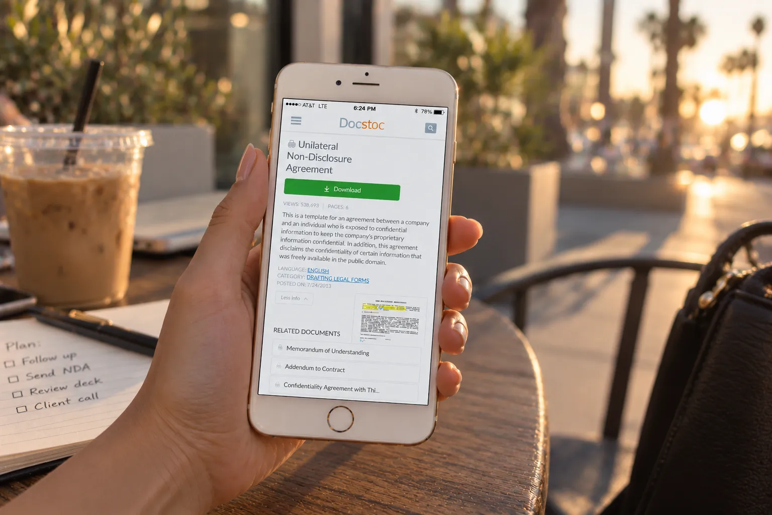
Strategic context & problem
Docstoc’s traffic came almost entirely from Google search, which meant SEO wasn’t a marketing afterthought layered on top of the product, it was the product’s growth model. Keeping pace with Google’s evolving best practices was a standing requirement, not a one-time project. On top of that, the logged-out site wasn’t adaptive: desktop and mobile experiences had drifted apart, and unifying them was the opportunity to address both problems in the same redesign instead of treating them as separate initiatives.
Process
I worked from two constraints simultaneously: what actually keeps organic search traffic converting, and what a single layout needs to do differently at phone width versus desktop width. That meant the homepage and the SEO document landing page got designed together rather than as separate efforts, since a visitor arriving from a Google search on either surface needed the same clarity about what Docstoc offered, whether they landed on a broad marketing page or a single document’s page.
Solution
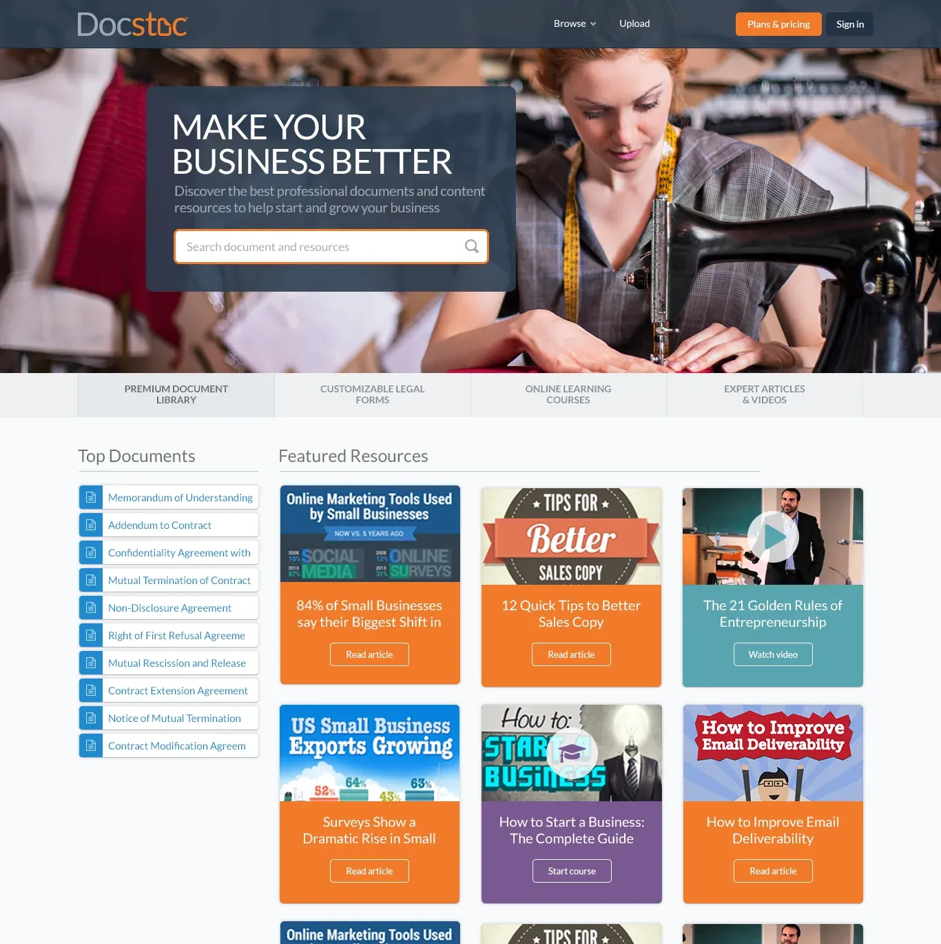
The homepage had to do double duty: communicate the depth of Docstoc’s content library to a cold visitor while still converting that visibility into a search, a browse, or a signup. I built it around a clear value-proposition hero with a prominent search bar, followed by category entry points and a featured-resources grid that gave a browsing visitor multiple ways in in without overwhelming a visitor who just wanted to search and leave.

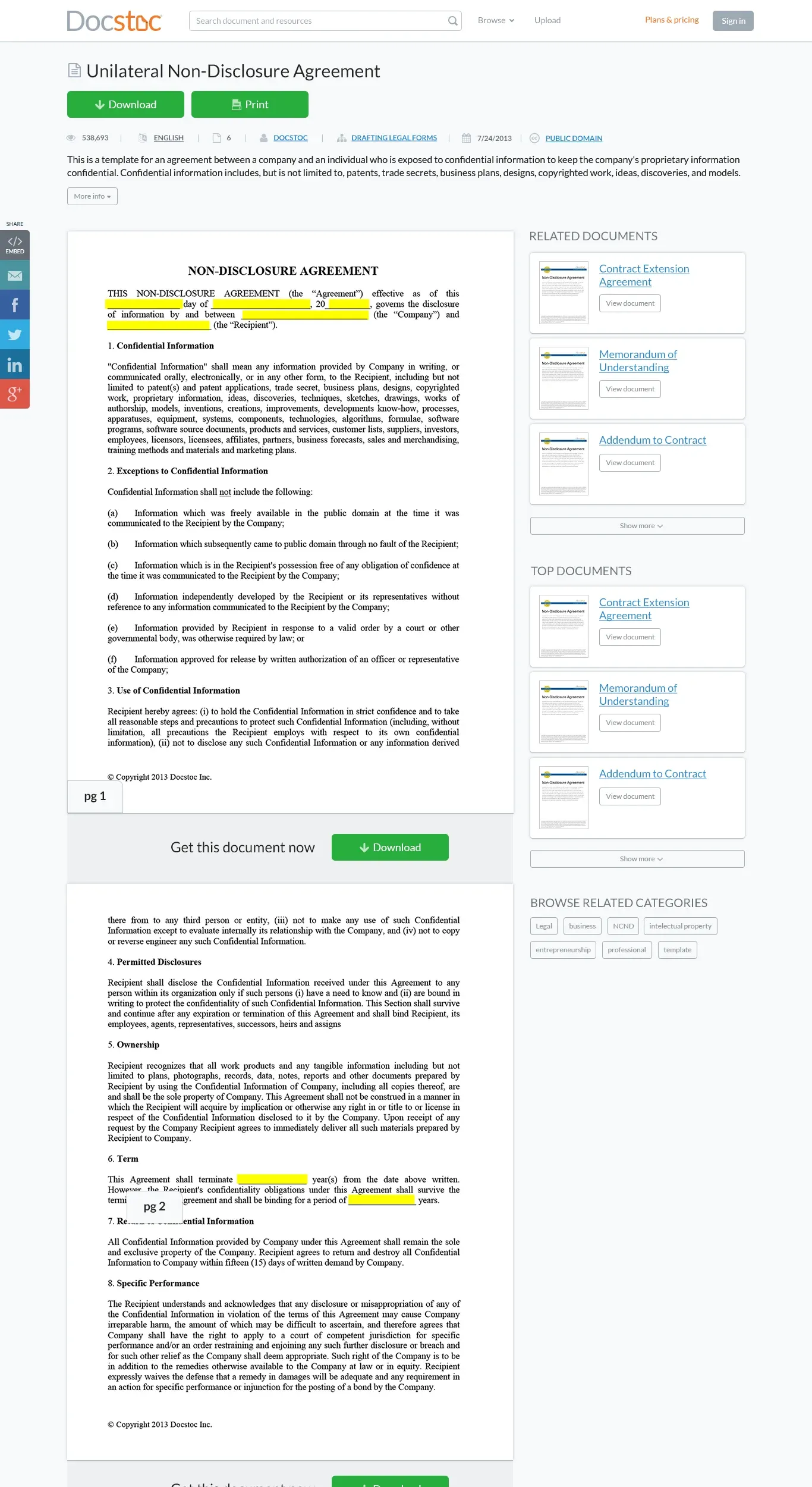
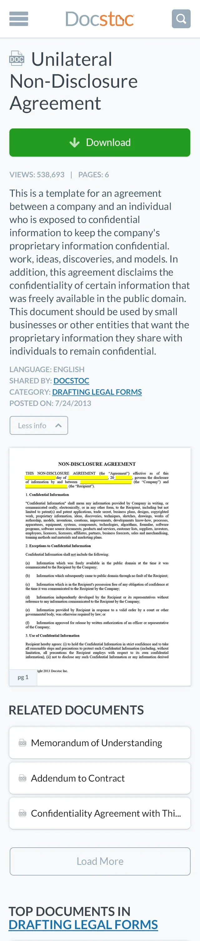
The SEO document page carried different pressure: it was usually the first and only page an organic visitor would ever see, so it had to make a strong impression fast while still surfacing a path deeper into the library. I optimized that flow around getting a visitor to their document, download or continue browsing, without friction, while keeping the related-documents and category context that Google’s crawlers and real visitors both used to find their next click.
Validation
Growth-driven experimentation, not a single research phase, drove most of the iteration here: visual design changes went out, engagement got measured, and the layout adjusted based on what actually moved behavior rather than what looked right in a mockup review.
Outcomes & impact
20%
increase in user engagement from the redesign
Takeaway
Designing for an SEO-first business model means the constraint isn’t really the screen, it’s an algorithm you don’t control and can’t fully predict. The lesson that stuck from this project: build the layout around what a cold, one-time visitor needs in the first few seconds, since on a site living off organic search, that visitor is the majority of your traffic, not the exception.
Other projects
Let's build something
worth trusting.
Get in touch
Have a role, a team, or a hard problem worth solving? Send a note and I'll get back to you.